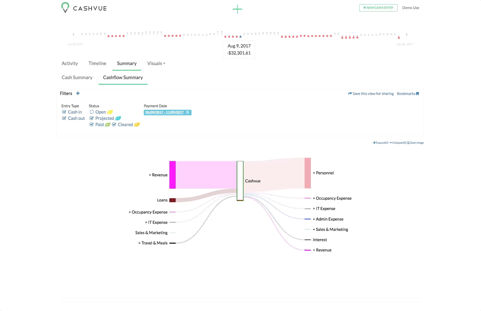
Your Cash Flow Summary chart gives you a visual look at your categories.
Color-coded lines help you easily recognize your categories, and the thickness of the lines quickly show you how much or how little cash each category has.
You can also expand and minimize these categories to see the break down of each one.
- Find a category with a + (plus sign), or
- Click the category name to expand it.

Alternatively, you can:
- Find the option to “Expand all” above the table.
- Click it to expand all the entries with sub-categories.
- Click Collapse all to return to the minimized view.