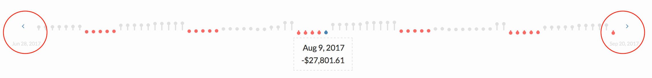
The Signal Graph gives you a visual timeline to look at your cash balance at the end of each day.
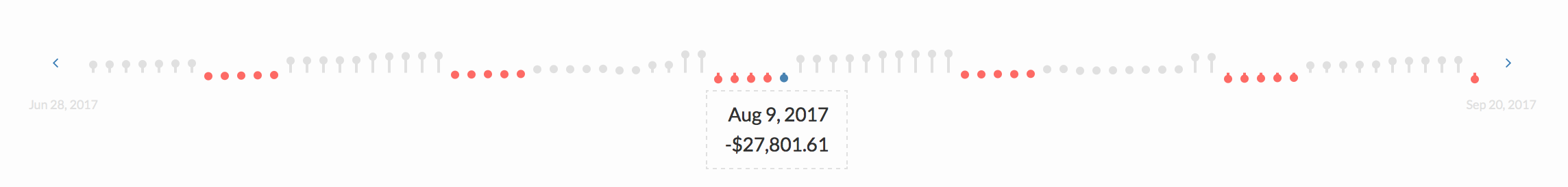
Navigating the Signal Graph
In the middle of the signal graph, indicated in blue, is the current date.
On the left of the current day, you have a past look at your cash balance. On the right side is the projected balance.
Colored Dots
- Gray dots indicate a positive balance. The higher the dot, the higher the balance.

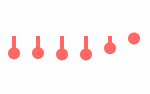
- Red dots indicate a negative balance. The lower the dot, the lower the balance.
Moving Left and Right
The arrows on either side of the signal graph allows you to look backward or forwards.