All of your summaries are set up to view your cash-ins and cash-outs in two easy-to-read forms, a graph and a table.
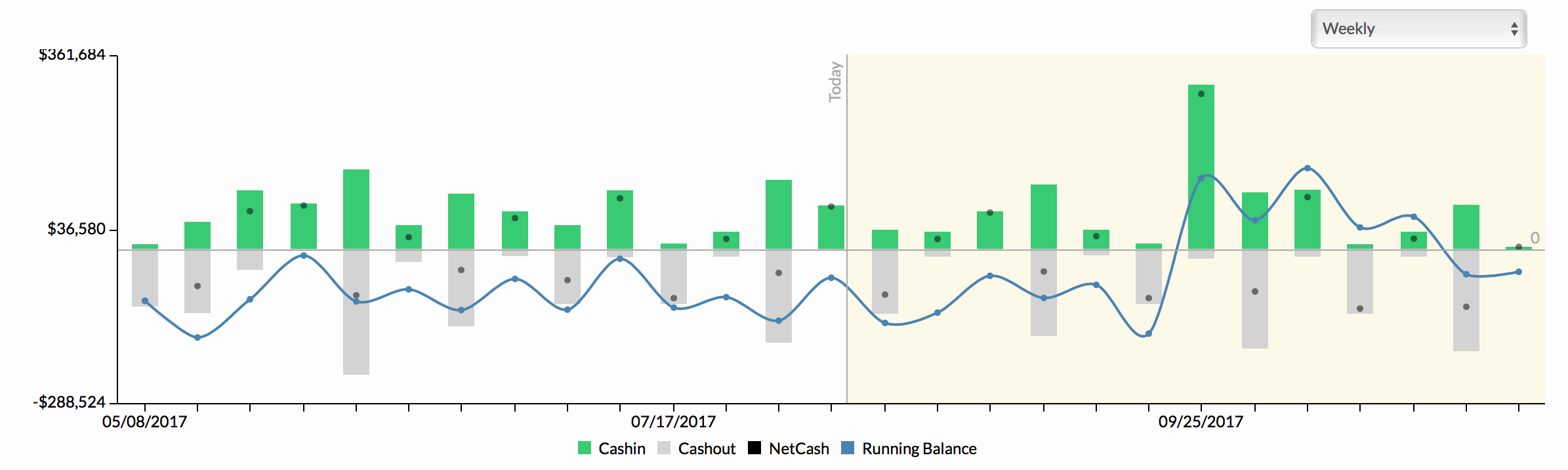
To read your graph:
- You will see a line down the middle. This indicates today’s date.
- The green upward bars are your cash-ins.
- The gray downward bars are your cash-outs.
- The black dot for each entry indicates your net cash. You can view the exact amount that incurs on a certain date by hovering over it.
- The blue line graph is your running balance.
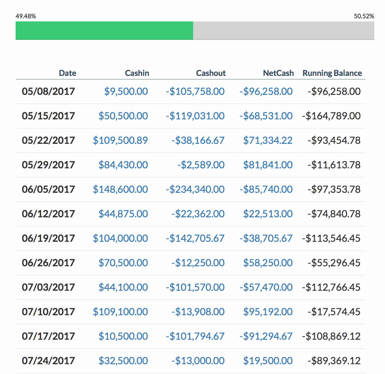
To read your table:
- The top of the table indicates a bar graph showing the total percentage of what is cashed-in and what is cashed-out.
- Each date shows the cash-in amount, the cash-out amount, the net cash and the running balance in one readable line.
- Click on any amount to open up the data details and breakdown of the amount (in daily/weekly/monthly/quarterly/yearly).
Related Articles
Changing Time Basis on the Runway Report
Edit or Delete Cash Entry in Monthly Snapshot
Select Time Basis in Cash Summary
Select Type of Schedule Basis: Daily, Weekly, Monthly, Quarterly, and Yearly